This begins a new set of posts around plotting locations on maps using R. To follow along with this post, you need your own data file with longitudes and latitudes, uniquely identified. I will be using my own set of data for this, but you can follow along using the locations data I posted on Github. There are .csv and .rds files available.
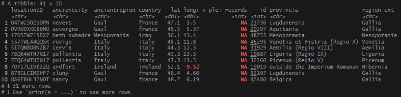
Finally, I had a set of neat, tidy locations. It was time to do something with them. Mapping seemed like a logical next step – but where to start? The foundation of churches and dioceses was a data point that popped up often in my research, so I thought that would be a good place to jump in.
In simple terms, a diocese or see, is the head of Catholic churches in a region, and is overseen by a Bishop. As Christianity grew, so did the establishment of churches, then dioceses to oversee them, and finally archdioceses, and patriarchal sees to oversee everything under them. There are many dioceses that were erected very early on, and indeed count apostles of Christ as their founders. An obvious example is Rome. The diocese is traditionally said to be founded and led by the first Pope, the apostle St. Peter, before his death in ~64.
My data came from 2 main sources: the diocese event list at Catholic Hierarchy, and via articles in the Catholic Encyclopedia housed at New Advent. These are websites that use scholarly, historical, and traditional sources for their information, and I felt comfortable using them for general information about the establishment of early dioceses. I went about getting the data ready to use in ggplot’s geom_sf() function, which would be used to plot the points onto a map.
In this post, I am not going to share the code or the data that I used to produce my locations list – mainly because it involves operations I have covered extensively (join and bind functions). As I said at the start, If you want to follow along, you just need a file or object that has individually identified longitude and latitude columns, or use one of the sets I link above.
For me, map visualizations were a brand new thing, and were not as straightforward as other visualizations have been. There were extra components: loading shapefiles, cropping to the area you want to focus on, making sure all the coordinate systems match, and also the use of simple features (sf) instead of x,y variables.
What are simple features? From what I could tell, sf’s are how spatial data and geometry are stored and used in a variety of data systems, especially geographic information systems (GIS). Sf’s and their coordinates can represent a lot of area-defining…things (“features”, if you will). These can be points on a map, a series of points that make a path or road, the span of an area, or its boundaries. I was primarily going to be using points, using only a longitude and a latitude.
There are many map plotting packages out there. After poking around, I settled on sf, a package that allows extensive manipulation and transformation of spatial data. It had easy to understand functions that would read my data and make it available to me for analysis and plotting.
In the very first place, I had to get my shapefiles. Shapefiles are vectorized files that contain the spatial information needed to produce a map layer for the plot. After poking around, I downloaded a map package from Natural Earth Data and unzipped it.
# This needs to be ran to prevent errors with rendering the world map below. This turns off
# spherical geometry package.
sf_use_s2(FALSE)

# Load packages.
library(tidyverse)
library(sf)

# Read in your world shapefile.
# These were downloaded from https://www.naturalearthdata.com/
world <- st_read("... directory where code resides... /ne_10m_admin_0_countries/ne_10m_admin_0_countries.shp")
Steps
- Load packages tidyverse and sf.
- Use
st_read()from the sf package to read in the shapefile (.shp). - Important: Keep the file structure from the .zip file in tact. The file folders need to reside in the same directory as your code for it to function correctly.
Next, I had to do a little prepping of my data so it could be read by the plotting function I was going to apply. Again, the sf package provided the functions to get things in working order.
# Check coordinates that the world map uses.
st_crs(world)

# Make sf object for plotting.
diocese_sf <- diocese_1 %>%
  dplyr::filter(status %in% c("Established","in_description","Erected")) %>%
  rename("lon" = longi) %>%
  dplyr::filter(!is.na(lat)) %>%
  dplyr::select(locationID, lon, lat) %>%
  st_as_sf(coords = c("lon", "lat")) %>%
  st_set_crs(st_crs(world))
Steps
- Filter my records only to the diocese dates that reflect the start or establishment of a diocese (
"Established","in_description","Erected"). - Other quick cleaning: fix the longitude column name so it can be read by the sf functions, filter out the
NAvalues, and select only the necessary columns:locationID,lon,lat. - With
st_as_sf(), - Use
st_set_crs()to match the coordinate system ofworld.
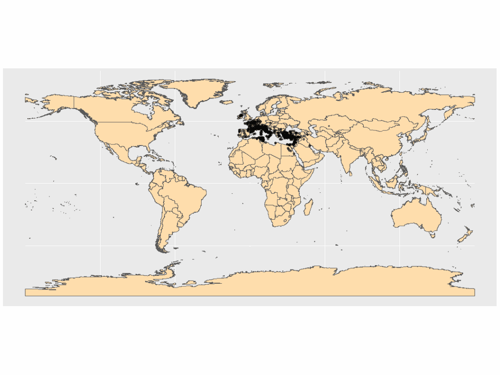
I passed the new object into ggplot and used the geom_sf() function to render both the shapefile and my location data. The resulting plot was not helpful.
I needed to crop the map. Finding my boundaries was easy, and the sf package had a cropping function that would constrain the map to a certain area. I just needed to find the min/max values of my coordinates, then use st_crop() to apply the boundaries.
# Find min/max of my location data for cropping to the area that holds all of my points.
diocese_1 %>%
  filter(!is.na(lat)) %>%
  summarize(min_lon = min(longi),
            max_lon = max(longi),
            min_lat = min(lat),
            max_lat = max(lat))

# Create the cropped polygon object
world_cropped <- st_crop(world,
        xmin = -10, xmax = 48,
        ymin = 23, ymax = 57)
Steps
- Filter the incomplete coordinates out of
diocese_1by removingNAvalues with!is.na(). Create a basic summary with the min and max of thelatandlongivalues.
- Using
st_crop(), create a cropped polygon object using the coordinates found in the previous step. I slightly decreased/increased the min/max values to give some breathing room to the points on the edges of the map
Now plot!
ggplot() +
  geom_sf(data = world_cropped,
          fill = "navajowhite") +
  geom_sf(data = diocese_sf,
          alpha = 0.5)
Steps
- Call
ggplot(). Here, I do not need to define aesthetics. X, Y values will come fromdiocese_sf.
- With
geom_sf(), add theworld_croppedobject as the first layer. I usednavajowhiteto color the land mass. - In the second
geom_sf(), add thediocese_sfobject. I adjusted the opacity to 50% withalpha = 0.5to make the clustered points more visible.
Results
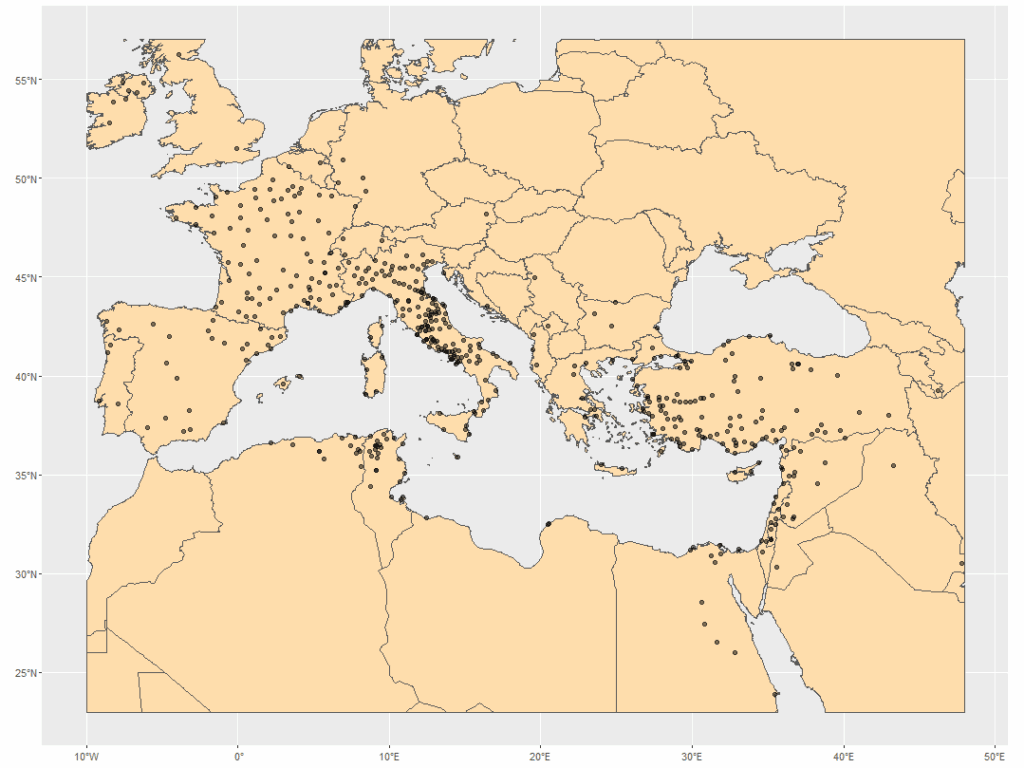
Much better! I immediately saw some interesting patterns in my points – something to explore, next.
Follow along script is on Github.
References and Resources
- Cheney, David M. (2025) “Catholic-Hierarchy: Its Bishops and Dioceses, Current and Past.” Copyright David M. Cheney, 1996-2025. https://www.catholic-hierarchy.org/.
- “CATHOLIC ENCYCLOPEDIA: Home.” (2025). https://www.newadvent.org/cathen/.
- Pebesma, E., & Bivand, R. (2023). Spatial Data Science: With Applications in R. Chapman and Hall/CRC. https://doi.org/10.1201/9780429459016
- “Natural Earth – Free Vector and Raster Map Data at 1:10m, 1:50m, and 1:110m Scales.” (2025). https://www.naturalearthdata.com/.