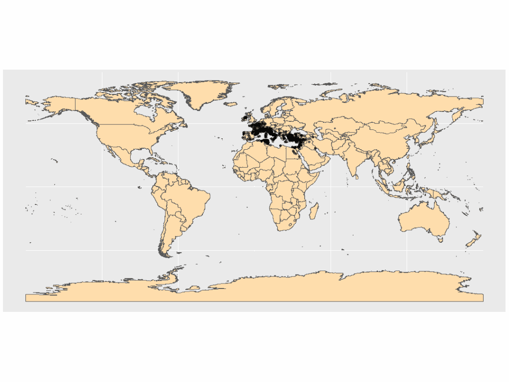
This post picks up after the last, and is a little longer than usual. I now have a map of the Mediterranean region, populated with plot points that represent diocese locations. These were generated through ggplot + geom_sf(), using my own location data. The following steps will focus on adding additional layers to the map, and defining time periods – both of which will add more visual information to my original map. To follow along with these instructions, have a data set with locations (including coordinates) and time spans associated with those records. If you Google “time series datasets” (or something similar), many, many options appear. You can also use something like the palmerpenguins::penguins_raw set, which includes locations and dates that could be plotted on a map (you will have to input coordinates, though). You can call it using the inline code I just included, or download/install the whole package.
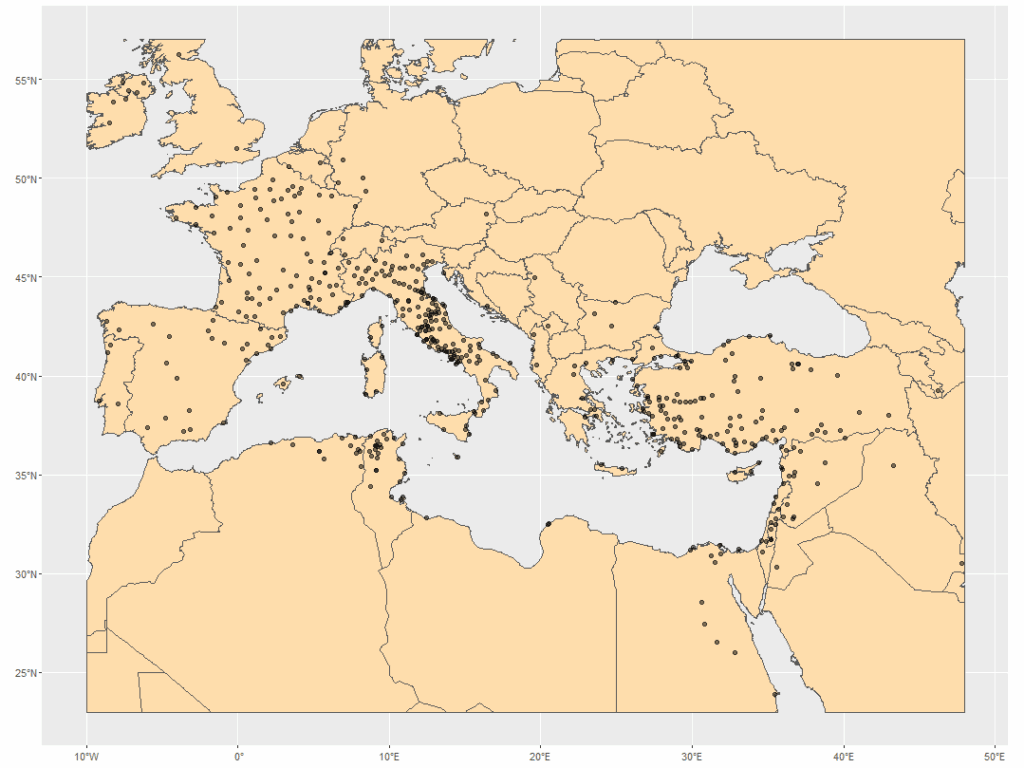
When I plotted my diocese locations in the last post, I noticed some pretty interesting patterns. Some of the dioceses seemed to follow a path. For instance, there was a pretty clear line in Egypt. Comparing this to even a modern map, I could see that these points probably followed the path of the Nile – which wasn’t surprising! The Nile was a major throughway in the region, and as people moved about the Roman Empire on established routes, so did Christianity. I saw similar patterns in Italy and Turkey. France’s dioceses seemed randomly placed, but I doubted that was actually the case.
I needed more information in my map and thankfully, this information is pretty abundant! Natural Earth, where I got my world map, also had shapefiles for rivers and waterways. After poking around, I found Harvard’s Dataverse offered a Roman Roads shapefile via their Digital Atlas of Roman and Medieval Civilization (DARMC), which is based off the famous Barrington Atlas of the Greek and Roman World. Layering these together would perhaps reveal a pattern of transmission via routes on both land and water.
I also wanted to highlight the time periods I was working through. I didn’t really have exact dates for the start of many of my dioceses, but I did have time ranges. I decided to render these into categories, creating a variable depending on which century the diocese began, was erected, or established. For the dioceses where I had no definite start years, but were definitely founded within the general timeframe of the first 5 centuries CE, I created an “undetermined” category – not ideal, but I really wanted to see if there was a pattern there, as well.
# Load packages.
library(tidyverse)
library(sf)

# Create categorized time periods.
diocese_w_century_cats <- diocese_1 %>%
  dplyr::filter(status %in% c("Established","in_description","Erected")) %>%
  rename("lon" = longi) %>%
  dplyr::filter(!is.na(lat)) %>%
  mutate(century = case_when(
    start == 0 & end == 500 ~ "undetermined",
    start >= 0 & start <= 99 ~ "first_c",
    start >= 100 & start <= 199 ~ "second_c",
    start >= 200 & start <= 299 ~ "third_c",
    start >= 300 & start <= 399 ~ "fourth_c",
    start >= 400 & start <= 499 ~ "fifth_c",
    .default = "out_of_bounds")) %>%
  mutate(century = factor(century, levels = c("first_c", "second_c", "third_c", "fourth_c", "fifth_c", "undetermined"))) %>%
  st_as_sf(coords = c("lon", "lat")) %>%
  st_set_crs(st_crs(world))
Steps
- Note: “diocese_1”
is my general data set of diocese coordinates, time spans, and status. Every record in my set will have each of these variables. - Filter the list to time spans that reflect that the diocese was Established, “in_description”, or Erected. The status “in_description” is my own designation and marks that a diocese was founded within my time frame of 0-499 CE, but a more precise beginning date hasn’t been located (yet).
- Rename “longi” to “long” so that the sf package will recognize my coordinate variables and convert them accordingly.
- Filter out incomplete coordinate sets with
filter(!is.na(lat)). - Use
case_when()to create a series of values based on the “start” value. This will bin all my dioceses according to the century they began – except for the “undetermined” records, which reflect those in the using the “in_description” value as the “start”. Years 0-99 are the 1st century, 100-199 the 2nd century, and so on. Anything with a start date outside of 0-499 CE will get a value of “out_of_bounds”. - I then converted those new values to factors and defined levels for them. This will ensure that the centuries are ordered as they should be and will appear in that order on the map output, with the “first_c” through the “fifth_c” in sequential order, and the “undetermined” value last.
- Use
st_as_sf(coords = c("lon", "lat"))to convert my coordinates to simple features (as before), and thenst_set_crs(), withst_crs(world)to make sure my coordinates use the same coordinate system the world shapefile uses.
Once I had my time categories, it was time to work on layering my maps. The layering process is really easy and works exactly as it did with the base maps. I downloaded and loaded the shapefiles, cropped them, then added them to my plot. I also wanted to make some tweaks to my plot points to make them more visible and the information more obvious. I decided to change the shape, color, and made the points totally opaque.
Considering category colors sent me off into a side-quest. Since I started using R, I’ve pretty much stuck to what colors are offered by the system or the palettes available in the RColorBrewer package. These have served me pretty well, but the artist in me craved more color options. Thankfully, I stumbled on the paletteer package, which “aims to collect all color palettes across the R ecosystem under the same package with a streamlined API”. Further, it had an associated Color Palette Finder housed at r-graph-gallery.com, which let me preview palettes and generated the associated code to use them. I finally landed on one called “LaCroixColoR::Lemon” (no doubt based on the yellow and blue colors of the beverage’s can) . This whole process was actually really fun. There are a ton of color options and I spent at least an hour trying on different palettes. Such awesome tools!
But back to the maps…
# This needs to be ran to prevent errors with rendering the world map below.
sf_use_s2(FALSE)

# Load paletteer
library(paletteer)

# Read in the shapefiles.
world <- st_read("... directory where code resides .../ne_10m_admin_0_countries/ne_10m_admin_0_countries.shp")

roman_roads <- st_read("...directory where code resides ... /harvard_dataverse/roman_roads_v2008.shp")

rivers_waterways <- st_read("...directory where code resides.../ne_10m_rivers_lake_centerlines/ne_10m_rivers_lake_centerlines.shp")

# Convert Roman Roads coordinate system.
roman_roads <- st_transform(roman_roads, 4326)

# Crop layers
world_cropped <- st_crop(world,
                         xmin = -10, xmax = 48,
                         ymin = 23, ymax = 57)

rivers_cropped <- st_crop(rivers_waterways,
                          xmin = -10, xmax = 48,
                          ymin = 23, ymax = 57)

# Plot all layers together.
ggplot() +
  geom_sf(data = world_cropped,
          fill = "ivory") +
  geom_sf(data = rivers_cropped,
          color = "navy") +
  geom_sf(data = roman_roads,
          color = "ivory3") +
  geom_sf(data = diocese_w_century_cats,
          aes(color = century),
          shape = 17,
          size = 2) +
  scale_color_paletteer_d("LaCroixColoR::Lemon") +
  theme_bw()
Steps
- Using
st_read(), read in the shapefiles from their directories. Remember: the shapefile parent directories need to be unzipped and saved in the same directory where your code lives. - The Roman Roads shapefile is already constrained to the right part of the map, so it does not need to be cropped in this step. However, the coordinate system is different from the WGS 84 (World Geodetic System 1984) used in “world”, so
st_transform(roman_roads, 4326)is used to convert it (represented by4326). - With
st_crop(), use the min and max values of your longitude (x) and latitude (y) to crop the “world” and the “rivers_waterways” maps to the right area. This is covered in more detail in the last post. Save each in their own objects (mine are “world_cropped” and “rivers_cropped”, respectively. - Plot the map
- Pull in the “
world_cropped” object/layer. Set the fill to “ivory”; - Pull in the “
rivers_cropped” object/layer. Set the color (lines) to “navy”; - Pull in the “
roman_roads” object/layer. Set the color (lines) to “ivory3” (a darker shade of “ivory” used above; - Pull in the diocese location data. In the
aes()function, apply color to the “century” variable. This will assign a different color for each unique “century” value. I also changed the size and shape of the plots – they now have a triangle shape (represented byshape = 17) and a larger size (size = 2). - Apply the aforementioned La Croix Lemon palette referenced in paletteer with
scale_color_paletteer_d("LaCroixColoR::Lemon").- Note: this is the line you change when swapping out color palettes found with the Color Palette Finder.
- Pull in the “
- Apply the black and white plot theme with
theme_bw().
Results
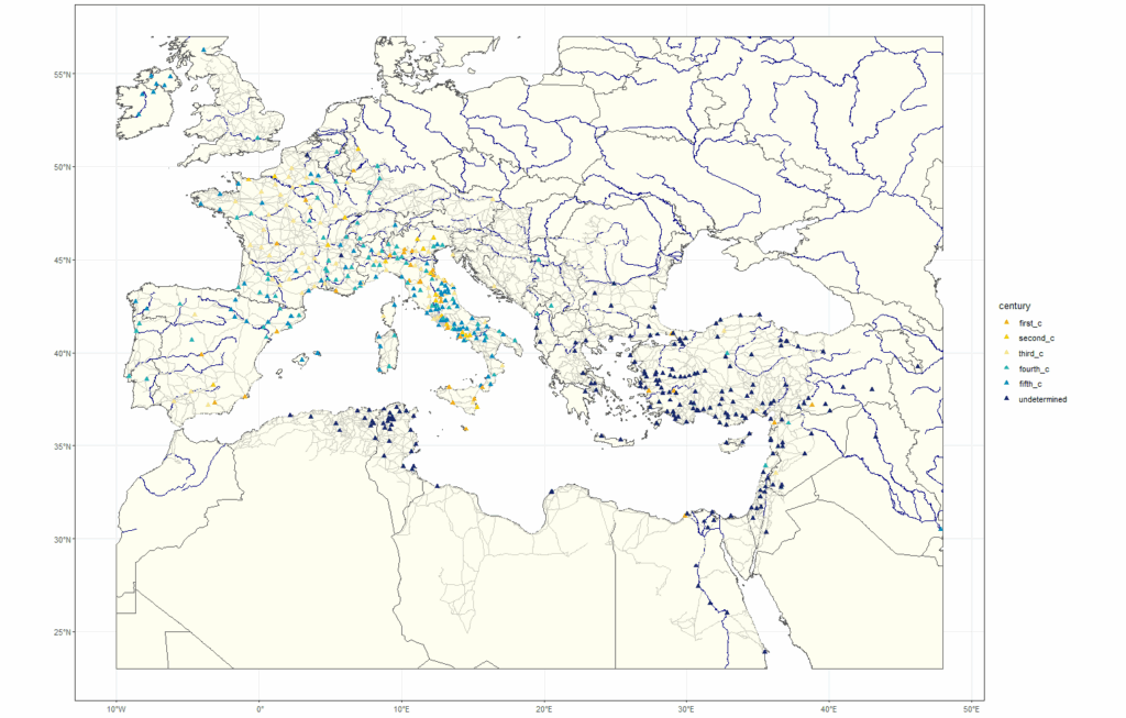
Now my points were more visible, and I could see the Roman road network, and rivers. That pattern following the Nile in Egypt was now obvious, even in the wide view. I wanted to check out some patterns I saw in Italy and Turkey, and the seeming lack of patterns in France.
A note here: you can see the longitude / latitudes pretty plainly on the borders of my plot. I used this to eyeball the coordinates for cropping down the larger maps and zooming into my desired regions. If you’re looking into France, Italy, and/or Turkey, then my coordinates below should work fine. Also note that Roman Roads does need to be cropped in these instances.
# Crop the map layers to the coordinates of the country being investigated. This needs to be done for each map plot.

# France
france_cropped <- st_crop(world,
                         xmin = -5, xmax = 9,
                         ymin = 42, ymax = 52)

roman_roads_france <- st_crop(roman_roads,
                               xmin = -5, xmax = 9,
                               ymin = 42, ymax = 52)

diocese_w_century_cats_france <- st_crop(diocese_w_century_cats,
                                     xmin = -5, xmax = 9,
                                     ymin = 42, ymax = 52)
rivers_france <- st_crop(rivers_cropped,
                             xmin = -5, xmax = 9,
                             ymin = 42, ymax = 52)

# Italy
italy_cropped <- st_crop(world,
                          xmin = 6, xmax = 19,
                          ymin = 35, ymax = 47)

roman_roads_italy <- st_crop(roman_roads,
                               xmin = 6, xmax = 19,
                               ymin = 35, ymax = 47)

rivers_italy <- st_crop(rivers_cropped,
                        xmin = 6, xmax = 19,
                        ymin = 35, ymax = 47)

diocese_w_century_cats_italy <- st_crop(diocese_w_century_cats,
                                     xmin = 6, xmax = 19,
                                     ymin = 35, ymax = 47)

# Turkey
turkey_cropped <- st_crop(world,
                          xmin = 25, xmax = 40,
                          ymin = 43, ymax = 35)

rivers_turkey <- st_crop(rivers_cropped,
                         xmin = 25, xmax = 40,
                         ymin = 43, ymax = 35)


roman_roads_turkey <- st_crop(roman_roads,
                               xmin = 25, xmax = 40,
                               ymin = 43, ymax = 35)

diocese_w_century_cats_turkey <- st_crop(diocese_w_century_cats,
                                     xmin = 25, xmax = 40,
                                     ymin = 43, ymax = 35)
Steps
- Steps for each country are the same: locate the min/max coordinates from the larger map, and use
st_crop()to crop each shapefile set. Save to their own objects/layers.
Now plot.
# France
ggplot() +
  geom_sf(data = france_cropped,
          fill = "ivory") +
  geom_sf(data = roman_roads_france,
          color = "ivory3") +
  geom_sf(data = rivers_france,
          color = "navy",
          alpha = 0.5) +
  geom_sf(data = diocese_w_century_cats_france,
          aes(color = century),
          shape = 17,
          size = 3) +
  scale_color_paletteer_d("LaCroixColoR::Lemon") +
  theme_bw()

# Italy
ggplot() +
  geom_sf(data = italy_cropped,
          fill = "ivory") +
  geom_sf(data = roman_roads_italy,
          color = "ivory3") +
  geom_sf(data = rivers_italy,
          color = "navy",
          alpha = 0.5) +
  geom_sf(data = diocese_w_century_cats_italy,
          aes(color = century),
          shape = 17,
          size = 3) +
  scale_color_paletteer_d("LaCroixColoR::Lemon") +
  theme_bw()

# Turkey
ggplot() +
  geom_sf(data = turkey_cropped,
          fill = "ivory") +
  geom_sf(data = roman_roads_turkey,
          color = "ivory3") +
  geom_sf(data = rivers_turkey,
          color = "navy",
          alpha = 0.5) +
  geom_sf(data = diocese_w_century_cats_turkey,
          aes(color = century),
          shape = 17,
          size = 3) +
  scale_color_paletteer_d("LaCroixColoR::Lemon") +
  theme_bw()
Steps – all are the same for each country map.
- Call
ggplot. - Pull in the main map object/layer – apply color “ivory”.
- Pull in the Roman Roads object/layer – apply color “ivory3”.
- Pull in the rivers object/layer – apply color “navy”, and apply half opacity to the color with
alpha = 0.5– features can look too….much when zoomed in at closer levels. This was easier on my eyes. - Add in the diocese locations. Enlarge the point size a little bit so that the points are easier to see (
size = 3). - Apply the La Croix Lemon palette and
theme_bw().
Results
Now, I could take a closer look at each, and consider the time periods in relation to their placement in the maps.
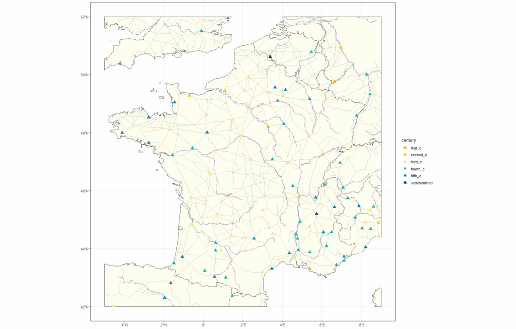
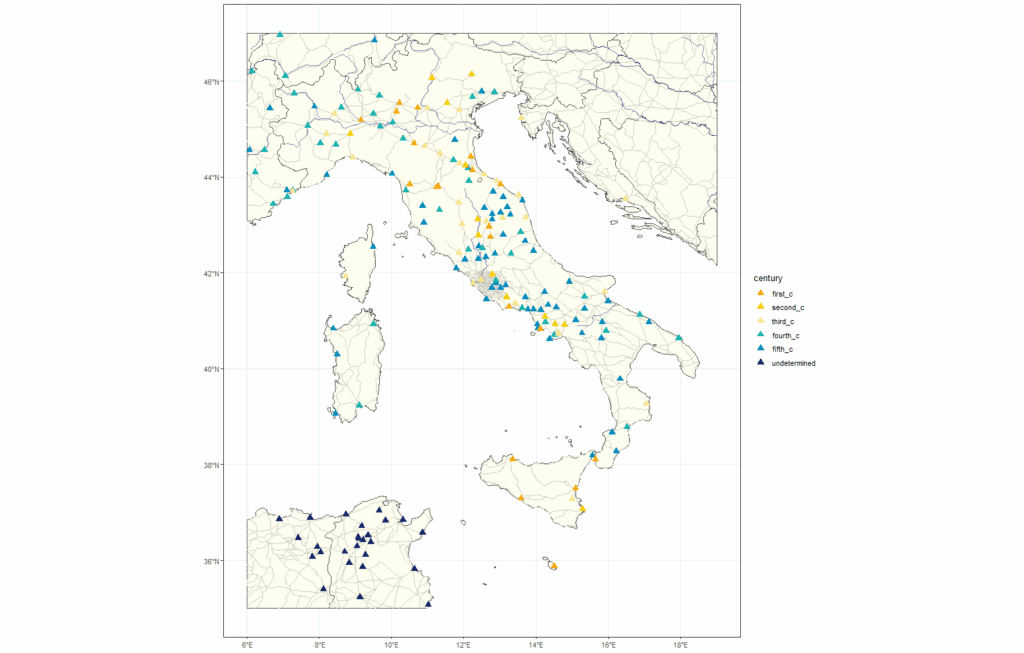
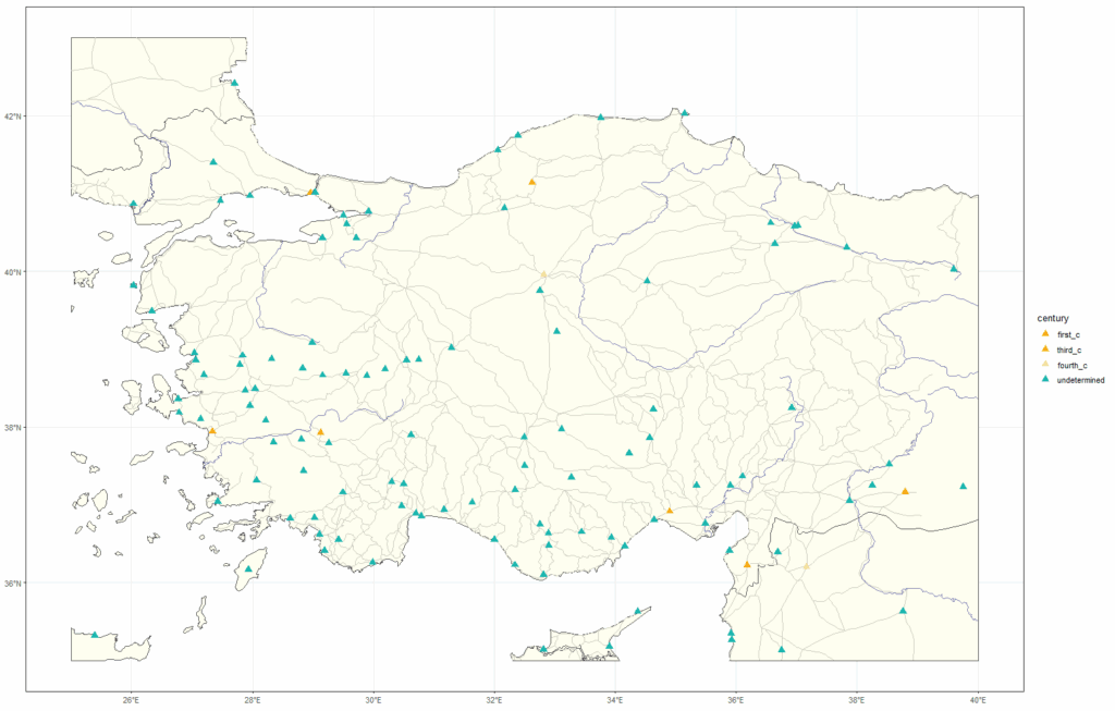
France, actually did seem to show a pattern. To me, it looked like there were many early dioceses, and they were located at crossroads within the Roman road network. There also appeared to be quite a few locations set up along rivers. Over in Italy, it looked like many early dioceses set up right along the roads that lead out of Rome and into the rest of the country, especially as they moved north into the Alps. There was a really nice, neat, straight road in the north-east with dioceses lined along it – I thought that was pretty cool, and oddly satisfying! Turkey also had several dioceses set up on roads, but I really did expect to see more pattern here. There was line of dioceses in the east-central portion I thought for sure would align to a road or a river, but nothing came through. Maybe there was another network that once existed that facilitated the transfer of people and ideas? That could be another point of research to jump onto.
A very distinct pattern that bore out was the positioning of most of the “undetermined” dioceses, which seemed to be heavily represented in the near and middle-east countries, as well as northern Africa (if you want to see this, reference the full map above). This isn’t entirely surprising – many of these dioceses, while very ancient, have been vacant for centuries. The available foundational history wasn’t there like it was for countries like Italy or France, which have been long and consistently Christianized. I don’t believe that info is impossible to find, though – it’ll just take some digging through some sources. Something R might be able to help with in the future!
Play around with your own data. Shapefiles for many different countries, features, and events exist out there. Not to mention all the color palette fun you can have with categorizing your data. See what patterns and jumping-off points you can find!
References and Resources
- McCormick, Michael; Huang, Guoping; Zambotti, Giovanni; Lavash, Jessica, 2013, “Roman Road Network (version 2008)”, https://doi.org/10.7910/DVN/TI0KAU, Harvard Dataverse, V1.
- Hvitfeldt E (2021). paletteer: Comprehensive Collection of Color Palettes. R package version 1.3.0, https://github.com/EmilHvitfeldt/paletteer.
- Holtz, Yan. (2025). “R Color Palette Finder.” https://r-graph-gallery.com/color-palette-finder.html.
- “Natural Earth – Free Vector and Raster Map Data at 1:10m, 1:50m, and 1:110m Scales.” (2025). https://www.naturalearthdata.com/.